


“I recently attended a webinar given by Kate Gladstone on Handwriting Repair and was so impressed that she thought to train us about how a young 5 year old thinks and feels when learning to write. How true that when a teacher tells the child to move the pencil “up” the page, that that does not necessarily translate correctly if the page is flat on a desk. We don’t all think alike, and may have different problems learning, depending on our point of view. It is refreshing to hear from a person who was in that position of having to overcome handwriting issues firsthand – and can now teach it in an organized and simple manner. Thank you Kate!”
YES!
Your handwriting can be fixed!

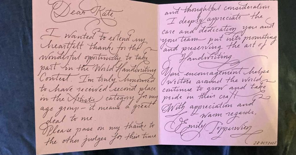
2026 World Handwriting Contest In Open!

How We Work
01
Contact
Contact with Kate to discuss your handwriting issues.
02
Conversation
Next, we’ll have a conversation about your needs & goals.
03
Agreement
We’ll agree on times, dates & general number of classes.
04
Write Onward!
We’ll begin together. Our goal? To vastly improve your handwriting!


Kate’s Press Includes

